|
How do we give option to the user to enter the date which provides the best experience to them?
Instead of creating our own UI to let the user enter the date, The best solution is to use an already available view or widget like DatePicker in the respective Platform. Shows a dialog containing a Material Design date picker. The initialDate property is used to display a default date when DatePicker dialog is opened. SetState will be called to update the selected date in UI and you are done. |
Minimum code to open a date picker: void openDatePicker(BuildContext context) async {
final DateTime? picked = await showDatePicker(
context: context,
initialDate: selectedDate,
firstDate: DateTime(2020),
lastDate: DateTime(2025),
);
if (picked != null && picked != selectedDate) {
setState(() {
selectedDate = picked;
});
}
}
This method actually calls showDatePicker function and waits for the date selected by the user. If a user does not select anything then the date return will be null otherwise the selected date.  |
|
Show/display date but maintain a date range to select date?
By setting the firstDate and the lastDate properties you can't select date outside the range.  |
Show the text input box instead of the calendar view
  void openDatePicker(BuildContext context) async {
    final DateTime? picked = await showDatePicker(
      context: context,
      initialDate: selectedDate, // initial date
      firstDate: DateTime(2020), // date range limit from
      lastDate: DateTime(2025), // date range limit upto
      initialEntryMode: DatePickerEntryMode.input, // show text input mode
    );
    if (picked != null && picked != selectedDate) {
      setState(() {
        selectedDate = picked;
      });
    }
  }
Available options are: calendar: will show calendar when load then you can change to input field mode. input: will show input field mode when load then you can change to calendar view calendarOnly: will show calendar view mode and user can't change to input field mode inputOnly: will show input field mode only and user can't change to calendar view  |
|
Show the year list first when open date picker
This option [initialDatePickerMode: DatePickerMode.year] open date picker to select year first, then user can select date later once year selected. void openDatePicker(BuildContext context) async {
final DateTime? picked = await showDatePicker(
context: context,
initialDate: selectedDate, // initial date
firstDate: DateTime(2020), // date range limit from
lastDate: DateTime(2025), // date range limit upto
initialEntryMode: DatePickerEntryMode.calendar, // show text input mode
initialDatePickerMode: DatePickerMode.year, // will show year selection first
);
if (picked != null && picked != selectedDate) {
setState(() {
selectedDate = picked;
});
}
}
 |
Allow the user to enter a date from a specific day range
  void openDatePicker(BuildContext context) async {
    final DateTime? picked = await showDatePicker(
      context: context,
      initialDate: selectedDate,
      firstDate: DateTime(2020),
      lastDate: DateTime(2025),
      selectableDayPredicate: _decideWhichDayToEnable,
    );
    if (picked != null && picked != selectedDate) {
      setState(() {
        selectedDate = picked;
      });
    }
  }

  bool _decideWhichDayToEnable(DateTime day) {
    if ((day.isAfter(DateTime.now().subtract(Duration(days: 1))) &&
        day.isBefore(DateTime.now().add(Duration(days: 10))))) {
      return true;
    }
    return false;
  }
 |
Change header title and button text
  void openDatePicker(BuildContext context) async {
    final DateTime? picked = await showDatePicker(
      context: context,
      initialDate: selectedDate,
      firstDate: DateTime(2020),
      lastDate: DateTime(2025),
      helpText: 'Select Some Date',
      cancelText: 'No Thanks',
      confirmText: 'Select This Date',
    );
    if (picked != null && picked != selectedDate) {
      setState(() {
        selectedDate = picked;
      });
    }
  }
 |
Change date picker display theme like font color, background color, font size, button color and size
  void openDatePicker(BuildContext context) async {
    final DateTime? picked = await showDatePicker(
      context: context,
      initialDate: selectedDate,
      firstDate: DateTime(2020),
      lastDate: DateTime(2025),
      builder: (context, child) {
        return Theme(
          data: Theme.of(context).copyWith(
            colorScheme: ColorScheme.light(
                primary: Colors.green,
                primaryVariant: Colors.black,
                secondaryVariant: Colors.black,
                onSecondary: Colors.black,
                onPrimary: Colors.white,
                surface: Colors.black,
                onSurface: Colors.black,
                secondary: Colors.black
            ),
            textTheme: const TextTheme(
              headline4: TextStyle(fontSize: 22.0, fontWeight: FontWeight.bold),//3
              bodyText1: TextStyle(fontSize: 25.0),//year selection
              subtitle2: TextStyle(fontSize: 22.0), //2
              caption: TextStyle(fontSize: 24.0),//day selection
              overline: TextStyle(fontSize: 22.0), //1
            ),
            dialogBackgroundColor: Colors.lightBlueAccent,
            textButtonTheme: TextButtonThemeData(
              style: TextButton.styleFrom(
                primary: Colors.red, // button text color
                textStyle: TextStyle(
                  fontSize: 22, // button text size
                )
              ),
            ),
          ),
          child: child!,
        );
      },
    );
    if (picked != null && picked != selectedDate) {
      setState(() {
        selectedDate = picked;
      });
    }
  }
 |
Showing posts with label flutter. Show all posts
Showing posts with label flutter. Show all posts
Tuesday, October 12, 2021
Flutter Date Picker - Customization of date picker with color and font size - dive into date picker
Saturday, October 9, 2021
Flutter Popup Menu Button Example Tutorial
| In flutter, popup menu button widget simply a popup / overflow menu in android and ios. It is similar to flutter dropdownButton but has additional features. We will learn how to attach a popup menu button widget in flutter and its properties in details. |
| In flutter, popup menu button widget displays an overflow menu when pressed. When we select an item the onSelected callback will be fired and the menu is dismissed as well. The value of the menu item selected by the end user will be available with onSelected callback. We can use the value to trigger actions as of our requirements. |
| The itemBuilder property is required which means without using it will throw an error. We have to use the Stateful widget as popup menu button will have a change in the state based on the user selection. |
| We should use either child or icon property but not both as it will throw an error. |
| The icon property is used to change the icon of the popup menu. By default, the popup menu displays an overflow menu(three dots) icon even if we don’t use the icon property. |
| We will use the itemBuilder property to add items to Popup Menu Button. It accepts a list of PopupMenuItems. |
| We will use the elevation property to apply elevation to the popup menu. Elevation makes the popup menu look as it is lifted upward from the background. |
| Full example given below: |
import 'package:flutter/material.dart';

void main() => runApp(const MyApp());

class MyApp extends StatelessWidget {
  const MyApp({Key? key}) : super(key: key);

  // This widget is the root of your application.
  @override
  Widget build(BuildContext context) {
    return MaterialApp(
      title: 'Flutter Demo',
      theme: ThemeData(
        primarySwatch: Colors.blue,
      ),
      home: const MyHomePage(),
    );
  }
}

class MyHomePage extends StatelessWidget {
  const MyHomePage({Key? key}) : super(key: key);

  @override
  Widget build(BuildContext context) {
    return Scaffold(
        appBar: ApplicationAppBar(),
        body: const MyHomePageImpl()
    );
  }
}

class MyHomePageImpl extends StatefulWidget {
  const MyHomePageImpl({Key? key}) : super(key: key);

  @override
  _MyHomePageImpl createState() => _MyHomePageImpl();
}

class _MyHomePageImpl extends State<MyHomePageImpl> {
  @override
  Widget build(BuildContext context) {
    return Container(
      padding: EdgeInsets.all(20),
      child: Column(
        children: [
          const SizedBox(height: 5),
          Row(
            children: [
              Expanded(
                  child: Text("Hello")
              ),
              Container(
                child: PopupMenuButton(
                    icon: Icon(Icons.more_horiz),
                    elevation: 40,
                    shape: const OutlineInputBorder(
                        borderSide: BorderSide(
                            color: Colors.green,
                            width: 2
                        )
                    ),
                    enabled: true,
                    onSelected: (value) {
                      print("Menu [$value] selected");
                    },
                    onCanceled: () {
                      print("None selected");
                    },
                    itemBuilder: (context) => [
                      PopupMenuItem(
                        child: Text("Menu 1"),
                        value: "menu_1",
                      ),
                      PopupMenuItem(
                        child: Text("Menu 2"),
                        value: "menu_2",
                      ),
                      PopupMenuItem(
                        child: Text("Menu 3"),
                        value: "menu_3",
                        enabled: false,
                      ),
                    ]
                ),
                //padding: const EdgeInsets.all(6.0),
                decoration: BoxDecoration(
                  border: Border.all(
                    color: Colors.lightGreen,
                  ),
                  borderRadius: BorderRadius.all(Radius.circular(23)),
                ),
              )
            ],
          ),
        ],
      ),
    );
  }
}

class ApplicationAppBar extends AppBar {
  ApplicationAppBar({Key? key}) : super(key: key,
    title: const Text("Popup Menu Button"),
    actions: [
      IconButton(icon: const Icon(Icons.add), onPressed: () {}),
    ],
  );
}
|
| Ouptu screenshot as below: |


|
Sunday, October 3, 2021
Flutter - design application with scrollbar enabled body with fixed header and footer | Header, Footer And Scrollable Body | How to create a scroll view with fixed footer with Flutter
|
A Flutter Widget that is scrollable with a sticky header to the header and footer to the bottom of screen of the end of the scroll body. You may simiply test with the example to see whether it is fit for your case. itemBuilder to build child widgets of scroll body; itemCount is the nunber of child widgets in scroll body.
Flutter is a mobile App SDK by Google which helps in creating Flutter: Material Design Using Scaffold AppBar Body Bottom Navigation Floating Action & Persistent Footer |
|
ListView is the most commonly used scrolling widget. It displays its children one after another in the scroll direction. In the cross axis, the children are required to fill the ListView.
The default constructor takes an explicit List The ListView.builder constructor takes an IndexedWidgetBuilder, which builds the children on demand. This constructor is appropriate for list views with a large (or infinite) number of children because the builder is called only for those children that are actually visible. |
| The ListView.separated constructor takes two IndexedWidgetBuilders: itemBuilder builds child items on demand, and separatorBuilder similarly builds separator children which appear in between the child items. This constructor is appropriate for list views with a fixed number of children. |
| ListView documentation |
| Full example as below: |
import 'package:flutter/material.dart';

void main() => runApp(new MyApp());

class MyApp extends StatelessWidget {
  // This widget is the root of your application.
  @override
  Widget build(BuildContext context) {
    return MaterialApp(
      title: 'Flutter Demo',
      theme: ThemeData(
        primarySwatch: Colors.blue,
      ),
      home: MyHomePage(),
    );
  }
}

class MyHomePage extends StatelessWidget {
  @override
  Widget build(BuildContext context) {
    return Scaffold(
        appBar: ApplicationAppBar(),
        body: MyHomePageImpl()
    );
  }
}

class MyHomePageImpl extends StatefulWidget {
  @override
  _MyHomePageImpl createState() => _MyHomePageImpl();
}

class _MyHomePageImpl extends State<MyHomePageImpl> {
  final Future<int> loadDataAsync = Future<int>.delayed(
    Duration(seconds: 1), () async => processDataAsync(),
  );

  static Future<int> processDataAsync() async {
    return 20;
  }

  @override
  Widget build(BuildContext context) {
    return Column(
      children: [
        SizedBox(height: 5),
        Container(
          width: double.infinity,
          padding: EdgeInsets.all(20),
          margin: EdgeInsets.fromLTRB(10, 10, 7, 10),
          child: Text("Fixed Header"),
          decoration: BoxDecoration(
              color: Colors.white,
              border: Border.all(
                color: Colors.red,
              ),
              borderRadius: BorderRadius.all(Radius.circular(10))
          ),
        ),
        Expanded(
          child: FutureBuilder(
            builder: (context, AsyncSnapshot snapshot) {
              if (snapshot.hasError) {
                return Center(
                  child: Column(
                    mainAxisAlignment: MainAxisAlignment.center,
                    crossAxisAlignment: CrossAxisAlignment.center,
                    children: [
                      Icon(
                        Icons.error_outline,
                        color: Colors.red,
                        size: 60,
                      ),
                      Padding(
                        padding: const EdgeInsets.only(top: 16),
                        child: Text('Error: ${snapshot.error}'),
                      )
                    ],
                  ),
                );
              }
              if (!snapshot.hasData) {
                return Center(
                  child: Column(
                    mainAxisAlignment: MainAxisAlignment.center,
                    crossAxisAlignment: CrossAxisAlignment.center,
                    children: [
                      SizedBox(height: 20),
                      SizedBox(
                        child: CircularProgressIndicator(),
                        width: 60,
                        height: 60,
                      ),
                      const Padding(
                        padding: EdgeInsets.only(top: 16),
                        child: Text('Awaiting result...'),
                      )
                    ],
                  ),
                );
              }
              return Column(
                children: [
                  Expanded(
                    child: Container(
                      padding: EdgeInsets.fromLTRB(0, 10, 0, 10),
                      margin: EdgeInsets.fromLTRB(10, 0, 10, 0),
                      decoration: BoxDecoration(
                          color: Colors.white,
                          border: Border.all(
                            color: Colors.red,
                          ),
                          borderRadius: BorderRadius.all(Radius.circular(10))
                      ),
                      child: ListView.builder(
                        physics: ScrollPhysics(),
                        shrinkWrap: true,
                        itemCount: snapshot.data,
                        itemBuilder: (BuildContext context, int index) {
                          return Padding(
                            padding: EdgeInsets.fromLTRB(10, 0, 10, 10),
                            child: Container(
                              padding: EdgeInsets.all(20),
                              decoration: BoxDecoration(
                                  color: Colors.white,
                                  border: Border.all(
                                    color: Colors.lightGreen,
                                  ),
                                  borderRadius: BorderRadius.all(Radius.circular(10))
                              ),
                              child: Center(
                                child: Text(
                                  'Child $index',
                                  style: TextStyle(color: Colors.black, fontSize: 22),
                                ),
                              ),
                            ),
                          );
                        },
                      ),
                    )
                  )
                ],
              );
            },
            future: loadDataAsync,
          ),
        ),
        Container(
          width: double.infinity,
          padding: EdgeInsets.all(20),
          margin: EdgeInsets.fromLTRB(10, 10, 10, 0),
          child: Text("Fixed Footer"),
          decoration: BoxDecoration(
              color: Colors.white,
              border: Border.all(
                color: Colors.red,
              ),
              borderRadius: BorderRadius.all(Radius.circular(10))
          ),
        ),
        SizedBox(height: 5),
      ],
    );
  }
}

class ApplicationAppBar extends AppBar {
  ApplicationAppBar() : super(
    title: Text("Fixed Header & Footer"),
    actions: [
      IconButton(icon: Icon(Icons.add), onPressed: () {}),
    ],
  );
}
|
Sample screenshot: 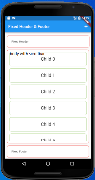 |
Tuesday, September 28, 2021
Flutter – How to limit keyboard to allow digits only - How to Make TextField Number only in Flutter - Digits Only Input Keyboard in Flutter – Only Numbers on Text Field - How to Create Number Inputfield in Flutter
|
This post is just my quick note on how to limit the soft keyboard to allow only digits.
TextField is one of the most commonly used widgets in Flutter. It helps users to enter their text input. In this tutorial, let’s learn how to make the textfield number only by changing the keyboard type in Flutter and apply regex to restrict other than valid numbers. Kyebord type input only show a keyboard with number inputs, but you can add like 4....4 which is not a number anyway, so let apply regex too to avoid such type of situation. |
|
You can specify the number as keyboard type for the TextField Widget using:
keyboardType: TextInputType.number Through this option, you can strictly restrict another char without a number. inputFormatters: [FilteringTextInputFormatter.digitsOnly], keyboardType: TextInputType.number, |
|
Lets apply regex to TextField to avoid unexpected input to TextField: I'm going to full example, first, created a file named input_validation_utils.dart with following contents: |
import 'package:flutter/services.dart';

abstract class StringValidator {
  bool isValid(String value);
}

class DecimalNumberEditValidator extends RegexValidator {
  DecimalNumberEditValidator() : super(regexSource: "^\$|^(0|([1-9][0-9]{0,7}))(\\.[0-9]{0,2})?\$");
}

class RegexValidator implements StringValidator {
  RegexValidator({required this.regexSource});
  final String regexSource;

  /// value: the input string
  /// returns: true if the input string is a full match for regexSource
  bool isValid(String value) {
    try {
      final regex = RegExp(regexSource);
      final matches = regex.allMatches(value);
      for (Match match in matches) {
        if (match.start == 0 && match.end == value.length) {
          return true;
        }
      }
      return false;
    }
    catch (e) {
      // Invalid regex
      assert(false, e.toString());
      return true;
    }
  }
}

class ValidatorInputFormatter implements TextInputFormatter {
  ValidatorInputFormatter({required this.editingValidator});
  final StringValidator editingValidator;

  TextEditingValue formatEditUpdate(TextEditingValue oldValue, TextEditingValue newValue) {
    final oldValueValid = editingValidator.isValid(oldValue.text);
    final newValueValid = editingValidator.isValid(newValue.text);
    if (oldValueValid && !newValueValid) {
      return oldValue;
    }
    return newValue;
  }
}
|
| Then we need to apply above validator to a TextField to restrict input other than numbers, now main.dart is looks like: |
import 'package:flutter/material.dart';
import 'package:flutter/services.dart';
import 'package:p1/input_validation_utils.dart';

void main() => runApp(new MyApp());

class MyApp extends StatelessWidget {
  // This widget is the root of your application.
  @override
  Widget build(BuildContext context) {
    return MaterialApp(
      title: 'Flutter Demo',
      theme: ThemeData(
        primarySwatch: Colors.blue,
      ),
      home: MyHomePage(),
    );
  }
}

class MyHomePage extends StatelessWidget {
  final String title = "Regex Input Validation";

  @override
  Widget build(BuildContext context) {
    return Scaffold(
      appBar: AppBar(
        title: Text(title),
      ),
      body: ListView(
        children: <Widget>[
          SizedBox(height: 30,),
          TextField(
            decoration: InputDecoration.collapsed(hintText: '\$0.00'),
            style: TextStyle(fontSize: 32.0, color: Colors.black87),
            textAlign: TextAlign.center,
            keyboardType: TextInputType.number,
            autofocus: true,
            //disabled auto correct if regex failed
            autocorrect: false,
            textInputAction: TextInputAction.done,
            inputFormatters: [
              //applying our custom formatter to TextField
              //so that input other than number can be input
              ValidatorInputFormatter(
                editingValidator: DecimalNumberEditValidator(),
              )
            ],
            onChanged: (value) {
              print("Input=${value}");
            },
          ),
          SizedBox(height: 30,),
          OutlinedButton(
              onPressed: () {
                Navigator.push(
                  context,
                  MaterialPageRoute(builder: (context) => MyHomePage()),
                );
              },
              child: Text("Forward")
          )
        ],
      ),
    );
  }
}
|
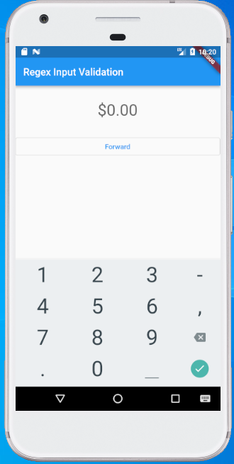
Sample screen shot as below:
 |
Monday, September 27, 2021
Flutter - Fetch data from the internet | Network Request | Fetch and display the data with Flutter | Networking in Flutter using the http package | How to point to localhost:8000 with the Dart http package in Flutter
| Today we will try to fetch the data from an API into a Flutter app. |
|
Firstly, we need to import the http package, which provides the simplest way to fetch data from the internet into our project.
Update your pubspec.yaml file: dependencies:
flutter:
sdk: flutter
http: # add this yours
|
|
Future is a core Dart class for working with async operations. A Future object represents a potential value or error that will be available at some time in the future.
The http.Response class contains the data received from a successful http call. Although it’s convenient, it’s not recommended to put an API call in a build() method. Flutter calls the build() method every time it needs to change anything in the view, and this happens surprisingly often. Leaving the fetch call in your build() method floods the API with unnecessary calls and slows down your app. The http.get() method is used to make a request to the specified ‘url’ and http.Response class contains the data received from a successful http call. We make this function of type Future because we will get the response for the request at some time in the future, not immediately. Future<http.Response> fetchPost() {
return http.get('https://base.url/api/account/get/x0303');
}
|
Usually, the returning response will have information about the status of the request call, which can be accessed using response.statusCode.
import 'package:http/http.dart' as http;
Future<Object> fetchPost() async {
  final response = await http.get(Uri.parse('https://base.url/api/account/get/x0303'));

  if (response.statusCode == 200) {
    print(" Status: OK")
	return json.decode(response.body);
  }
  else {
    throw Exception('Failed to get data');
  }
}
|
Full example is as below
import 'dart:convert';

import 'package:flutter/material.dart';
import 'package:http/http.dart' as http;

void main() => runApp(MyApp());

class MyApp extends StatelessWidget {
  @override
  Widget build(BuildContext context) {
    return MaterialApp(
      title: 'Flutter Demo',
      theme: ThemeData(
        primarySwatch: Colors.blue,
        visualDensity: VisualDensity.adaptivePlatformDensity,
      ),
      home: ApplicationBase(),
    );
  }
}

class ApplicationBase extends StatefulWidget {
  const ApplicationBase({Key? key}) : super(key: key);

  @override
  _ApplicationBaseState createState() => _ApplicationBaseState();
}

class _ApplicationBaseState extends State<ApplicationBase> {
  @override
  void initState() {
    super.initState();
  }

  Future<String> _calculation = Future<String>.delayed(
    Duration(seconds: 2), () => loadDataAsync(),
  );

  // flutter thread to load data
  static Future<String> loadDataAsync() async {
    return Future.delayed(Duration(seconds: 0), () async {
      final response = await http.get(Uri.parse('https://base.url/api/account/get/x0303'));

      if (response.statusCode == 200) {
        var data = json.decode(response.body);
        return data["result"] == null ? throw Exception(data["error"].toString()) : data["result"];
      }
      else {
        throw Exception('Failed to get data');
      }
    });
  }

  @override
  Widget build(BuildContext context) {
    //_onPressed(context);
    return Scaffold(
      appBar: AppBar(
        title: Text("My Test App"),
      ),
      body: Center(
          child: FutureBuilder<String>(
            future: _calculation,
            builder: (BuildContext context, AsyncSnapshot<String> snapshot) {
              List<Widget> children;

              if (snapshot.hasData) {
                children = <Widget>[
                  Text("Data loaded from http call = ${snapshot.data}")
                ];
              }
              else if (snapshot.hasError) {
                children = <Widget>[
                  Icon(
                    Icons.error_outline,
                    color: Colors.red,
                    size: 60,
                  ),
                  Padding(
                    padding: const EdgeInsets.only(top: 16),
                    child: Text('Error: ${snapshot.error}'),
                  )
                ];
              }
              else {
                children = <Widget>[
                  SizedBox(height: 20),
                  SizedBox(
                    child: CircularProgressIndicator(),
                    width: 60,
                    height: 60,
                  ),
                  const Padding(
                    padding: EdgeInsets.only(top: 16),
                    child: Text('Awaiting result...'),
                  )
                ];
              }
              return Center(
                child: Column(
                  mainAxisAlignment: MainAxisAlignment.center,
                  crossAxisAlignment: CrossAxisAlignment.center,
                  children: children,
                ),
              );
            }
          )
      ),
      floatingActionButton: FloatingActionButton(
        onPressed: () {
          Navigator.push(
            context,
            MaterialPageRoute(builder: (context) => const ApplicationBase()),
          );
        },
        child: Icon(Icons.add),
      ),
    );
  }
}
|
|
For test purpose, if you want to call your localhost from Flutter then do the below: replace 'localhost' in your url to wifi connection ip e.g : 'http://localhost:8000' => 'http://192.168.1.102:8000'. you can get your wifi ip from command prompt with cmd>ipconfig (wireless LAN adapter WI-FI.  |
Sample screen shot 
 |
Sunday, September 26, 2021
Set up App Loading or Progress indicator using dialog box in Flutter
| Ideally, the progress indicator is shown on top of everything, preventing the user from interacting with the UI. |
| we want is to display a context so that the user knows, what he is actually waiting for. So let’s add some descriptive text and put everything in a container to make it stand out from the rest of the widget. |
| Full code example below: |
import 'package:flutter/material.dart';

void main() => runApp(MyApp());

class MyApp extends StatelessWidget {
  @override
  Widget build(BuildContext context) {
    return MaterialApp(
      title: 'Flutter Demo',
      theme: ThemeData(
        primarySwatch: Colors.blue,
        visualDensity: VisualDensity.adaptivePlatformDensity,
      ),
      home: ApplicationBase(),
    );
  }
}

class ApplicationBase extends StatefulWidget {
  const ApplicationBase({Key? key}) : super(key: key);

  @override
  _ApplicationBaseState createState() => _ApplicationBaseState();
}

class _ApplicationBaseState extends State<ApplicationBase> {
  int _counter = 0;

  // flutter thread to load data
  Future loadDataAsync() async {
    return Future.delayed(Duration(seconds: 5), () {
      setState(() {
        _counter++;
      });
    });
  }

  @override
  Widget build(BuildContext context) {
    return Scaffold(
      appBar: AppBar(
        title: Text("My Test App"),
      ),
      body: Center(
          child: Text('Count = $_counter')
      ),
      floatingActionButton: FloatingActionButton(
        onPressed: () {
          _onPressed(context);
        },
        child: Icon(Icons.add),
      ),
    );
  }

  void _onPressed(BuildContext context) async {
    // showing progress bar at dialog
    DialogBuilder(context).showLoadingIndicator();
    // loading data in thread and using [await] to wait for completion of task
    await loadDataAsync();
    // hiding dialog
    DialogBuilder(context).hideOpenDialog();
  }
}

class DialogBuilder {
  DialogBuilder(this.context);

  final BuildContext context;

  void showLoadingIndicator() {
    showDialog(
      context: context,
      //disable disappear dialog on touch on screen
      barrierDismissible: false,
      builder: (BuildContext context) {
        return WillPopScope(
          //this will prevent close dialog on press back button
          onWillPop: () async => false,
          child: AlertDialog(
            shape: RoundedRectangleBorder(
                borderRadius: BorderRadius.all(Radius.circular(8.0))
            ),
            backgroundColor: Colors.black87,
            content: Container(
                padding: EdgeInsets.all(16),
                color: Colors.black87,
                child: Column(
                    mainAxisAlignment: MainAxisAlignment.center,
                    mainAxisSize: MainAxisSize.min,
                    children: [
                      Padding(
                          child: Container(
                              child: CircularProgressIndicator(
                                  strokeWidth: 3
                              ),
                              width: 40,
                              height: 40
                          ),
                          padding: EdgeInsets.only(bottom: 16)
                      ),
                      Padding(
                          child: Text(
                            'Please wait ...',
                            style: TextStyle(
                                color: Colors.white,
                                fontSize: 16
                            ),
                            textAlign: TextAlign.center,
                          ),
                          padding: EdgeInsets.only(bottom: 4)
                      )
                    ]
                ),
            ),
          ),
        );
      },
    );
  }

  void hideOpenDialog() {
    //disappear dialog
    Navigator.of(context).pop();
  }
}
|
| Now, what we have is something like that: |
 |
Subscribe to:
Posts (Atom)