|
For web view in flutter, we use webview_flutter, a Flutter package that provides a WebView widget on Android and iOS.
To get started, first add webview_flutter as a dependency in your pubspec.yaml file, like this: webview_flutter: ^0.3.19+9 Incase you get this error Cannot run with sound null safety, because the following dependencies do IDE run arguments/configuration To set this up in your IDE of choice, you can use: In IntelliJ/Android Studio: "Edit Configurations" (in your run configurations) → "Additional run args". In Visual Studio Code: search for "Flutter run additional args" in your user settings. In both cases, add --no-sound-null-safety. |
| After adding webview_flutter package, you can use WebView() widget. This widget has three basic arguments, thye're key, javascriptMode & initialUrl. See the implementation below: |
| Code Snippet: Web View Open Website URL in Flutter |
import 'package:flutter/cupertino.dart'; import 'package:flutter/material.dart'; import 'package:webview_flutter/webview_flutter.dart'; void main() => runApp(MyApp()); class MyApp extends StatelessWidget { @override Widget build(BuildContext context) { return MaterialApp( title: 'Web View URL Example', home: Scaffold( appBar: AppBar( title: Text('Web View URL Example'), centerTitle: true, ), body: WebViewExample('https://www.google.com/'), ), ); } } class WebViewExample extends StatefulWidget { final String url; WebViewExample(this.url); @override _WebViewExampleState createState() => _WebViewExampleState(); } class _WebViewExampleState extends State<WebViewExample> { final _key = UniqueKey(); @override Widget build(BuildContext context) { return Container( child: Column( children: <Widget>[ Expanded( child: WebView( key: _key, javascriptMode: JavascriptMode.unrestricted, initialUrl: widget.url, ), ), ], ), ); } } |
Output: Web View Open Website URL in Flutter  |
| For more details please see WebView for Flutter which has documentation for this package. |
Showing posts with label android. Show all posts
Showing posts with label android. Show all posts
Wednesday, September 21, 2022
Web Views Open Website URL in Flutter Example & Output
Flutter Multiple Styles in Single Line: Use RichText & TextSpan
|
In Flutter, if you need to design single line with multiple styles then it can be done by using RichText widget with TextSpan.
RichText widget displays text with different styles. Different text to display is represented using a tree of TextSpan widgts. Each of these TextSpan widgets are associated with different style. In this flutter example, we are going to implement simple application that displays multiple styles on same line. |
| Code Snippet: Text with Multiple Styles |
import 'package:flutter/material.dart'; void main() => runApp(MyApp()); class MyApp extends StatelessWidget { @override Widget build(BuildContext context) { return MaterialApp( title: 'RichText + TextSpan Example', home: Scaffold( appBar: AppBar( title: Text('RichText+ TextSpan Example'), centerTitle: true, ), body: Center( child: RichText( text: TextSpan( text: 'Style 1 ', style: TextStyle( color: Colors.blue, fontWeight: FontWeight.bold, fontSize: 24, ), children: remainingItems() ), ), ), ), ); } List<InlineSpan> remainingItems() { return [ TextSpan( text: 'Style 2 ', style: TextStyle( color: Colors.white, backgroundColor: Colors.teal, fontSize: 20, ), ), TextSpan( text: 'Style 3 ', style: TextStyle( color: Colors.orange, fontFamily: 'courier', fontSize: 24, ), ), TextSpan( text: 'Style 4 ', style: TextStyle( fontStyle: FontStyle.italic, color: Colors.pink, fontSize: 18, ), ), ]; } } |
Output: Multiple Styles for Text  |
|
Based on layout constraints the text might break across multiple lines or might all be displayed on the same line. For more details please see RichText for Flutter which has documentation for this widget. |
Thursday, October 21, 2021
Get Android API level of phone currently running my application
| How do I get the Api level of the phone curently running my application |
|
Check android.os.Build.VERSION, which is a static class that holds various pieces of information about the Android OS a system is running.
If you care about all versions possible (back to original Android version), as in minSdkVersion is set to anything less than 4, then you will have to use android.os.Build.VERSION.SDK, which is a String that can be converted to the integer of the release. If you are on at least API version 4 (Android 1.6 Donut), the current suggested way of getting the API level would be to check the value of android.os.Build.VERSION.SDK_INT, which is an integer. |
| In either case, the integer you get maps to an enum value from all those defined in android.os.Build.VERSION_CODES: |
SDK_INT value        Build.VERSION_CODES        Human Version Name
    1                  BASE                      Android 1.0 (no codename)
    2                  BASE_1_1                  Android 1.1 Petit Four
    3                  CUPCAKE                   Android 1.5 Cupcake
    4                  DONUT                     Android 1.6 Donut
    5                  ECLAIR                    Android 2.0 Eclair
    6                  ECLAIR_0_1                Android 2.0.1 Eclair
    7                  ECLAIR_MR1                Android 2.1 Eclair
    8                  FROYO                     Android 2.2 Froyo
    9                  GINGERBREAD               Android 2.3 Gingerbread
   10                  GINGERBREAD_MR1           Android 2.3.3 Gingerbread
   11                  HONEYCOMB                 Android 3.0 Honeycomb
   12                  HONEYCOMB_MR1             Android 3.1 Honeycomb
   13                  HONEYCOMB_MR2             Android 3.2 Honeycomb
   14                  ICE_CREAM_SANDWICH        Android 4.0 Ice Cream Sandwich
   15                  ICE_CREAM_SANDWICH_MR1    Android 4.0.3 Ice Cream Sandwich
   16                  JELLY_BEAN                Android 4.1 Jellybean
   17                  JELLY_BEAN_MR1            Android 4.2 Jellybean
   18                  JELLY_BEAN_MR2            Android 4.3 Jellybean
   19                  KITKAT                    Android 4.4 KitKat
   20                  KITKAT_WATCH              Android 4.4 KitKat Watch
   21                  LOLLIPOP                  Android 5.0 Lollipop
   22                  LOLLIPOP_MR1              Android 5.1 Lollipop
   23                  M                         Android 6.0 Marshmallow in October 2015
   24                  N                         Android 7.0 Nougat in August 2016
   25                  N_MR1                     Android 7.1.1 Nougat in October 2016
   26                  O                         Android 8.0 Oreo in August 2017
   27                  O_MR1                     Android 8.1 Oreo MR1 in December 2017
   28                  P                         Android 9 Pie in August 2018
   29                  Q                         Android 10 in September 2019
   30                  R                         Android 11 in September 2020
  10000                CUR_DEVELOPMENT           Current Development Version
|
| All informatio collected from https://developer.android.com/reference/android/os/Build.VERSION_CODES |
Saturday, December 1, 2018
Android How to create Buttons of equal width in a row on any Screen width | How to implement linearlayout with 2 buttons, Horizontal and Vertical | Set two buttons to same width regardless of screen size
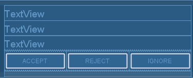
| It is a common requirement to layout a bunch of buttons side by side. Making them of equal width is just plain good GUI design. |
| To achieve the effect above, first create a LinearLayout just for the buttons. The layout will contain three buttons. |
<LinearLayout android:id="@+id/linearLayout1" android:layout_height="wrap_content" android:layout_width="fill_parent"> <Button android:id="@+id/button_accept" android:text="Accept" android:layout_weight="1" android:layout_height="40sp" android:layout_width="0dp"/> <Button android:id="@+id/button_reject" android:text="Reject" android:layout_weight="1" android:layout_height="40sp" android:layout_width="0dp"/> <Button android:id="@+id/button_ignore" android:text="Ignore" android:layout_weight="1" android:layout_height="40sp" android:layout_width="0dp"/> </LinearLayout> |
|
We took these steps to get the effect: 1. For the LinearLayout we set android:layout_width="fill_parent". This causes the layout view to take up the full width available from the device. 2. For each Button, we set android:layout_width="fill_parent" and android:layout_weight="1". |
 |
Friday, October 26, 2018
Android: ActionBar (Top Title Bar) with Custom View (Using Custom Layout as App Title) Example with Top Navigation View Example
| n this tutorial, we will create an example to customize ActionBar with a custom layout in Android. Before we begin, I assume you already have created an Android application. BELOW THERE IS FULL SOURCE CODE |
|
1. Main layout file:
*** android.support.v7.widget.Toolbar will be replaced by our custom action bar |
<?xml version="1.0" encoding="utf-8"?> <!-- Use DrawerLayout as root container for activity --> <android.support.v4.widget.DrawerLayout xmlns:android="http://schemas.android.com/apk/res/android" xmlns:app="http://schemas.android.com/apk/res-auto" android:id="@+id/drawer_layout" android:layout_width="match_parent" android:layout_height="match_parent" android:fitsSystemWindows="true"> <!-- Layout to contain contents of main body of screen (drawer will slide over this) --> <FrameLayout android:id="@+id/content_frame" android:layout_width="match_parent" android:layout_height="match_parent" android:background="#fff"> <android.support.v7.widget.Toolbar android:id="@+id/toolbar" android:layout_width="match_parent" android:layout_height="?attr/actionBarSize" android:background="#FF4081" android:theme="@style/ThemeOverlay.AppCompat.ActionBar" /> </FrameLayout> <!-- Container for contents of drawer - use NavigationView to make configuration easier --> <android.support.design.widget.NavigationView android:id="@+id/nav_view" android:layout_width="wrap_content" android:layout_height="match_parent" android:layout_gravity="start" android:fitsSystemWindows="true" app:menu="@menu/navigation" app:headerLayout="@layout/nav_header" /> <LinearLayout xmlns:android="http://schemas.android.com/apk/res/android" xmlns:tools="http://schemas.android.com/tools" android:layout_width="match_parent" android:layout_height="wrap_content" android:orientation="vertical" tools:context="pkm.com.customTitleBar.MainActivity" android:paddingTop="60dp"> <ScrollView style="@android:style/Widget.ScrollView" android:layout_width="match_parent" android:layout_height="0dip" android:layout_gravity="top" android:layout_weight="1" android:fillViewport="false" android:scrollbarStyle="insideInset"> <LinearLayout android:id="@+id/mainLayoutScrollView" android:layout_width="match_parent" android:layout_height="wrap_content" android:orientation="vertical"> </LinearLayout> </ScrollView> <LinearLayout android:id="@+id/mainViewBottomBar" android:layout_width="match_parent" android:layout_height="wrap_content" android:minHeight="20dp" android:orientation="vertical"> </LinearLayout> </LinearLayout> </android.support.v4.widget.DrawerLayout> |
|
2. Sample AndroidManifest.xml *** Turned off default action bar using > android:theme="@style/AppTheme.NoActionBar" |
<?xml version="1.0" encoding="utf-8"?> <manifest xmlns:android="http://schemas.android.com/apk/res/android" package="pkm.com.customTitleBar"> <application android:allowBackup="true" android:icon="@mipmap/ic_launcher" android:label="@string/app_name" android:roundIcon="@mipmap/ic_launcher_round" android:supportsRtl="true" android:theme="@style/AppTheme"> <activity android:name=".MainActivity" android:label="@string/app_name" android:theme="@style/AppTheme.NoActionBar"> <intent-filter> <action android:name="android.intent.action.MAIN" /> <category android:name="android.intent.category.LAUNCHER" /> </intent-filter> </activity> </application> </manifest> |
| *** android:theme="@style/AppTheme.NoActionBar" is defined in RES/VALUES/STYLES.XML as BELOW |
<resources> <!-- Base application theme. --> <style name="AppTheme" parent="Theme.AppCompat.Light.DarkActionBar"> <!-- Customize your theme here. --> <item name="colorPrimary">@color/colorPrimary</item> <item name="colorPrimaryDark">@color/colorPrimaryDark</item> <item name="colorAccent">@color/colorAccent</item> </style> <style name="AppTheme.NoActionBar"> <item name="windowActionBar">false</item> <item name="windowNoTitle">true</item> </style> </resources> |
| 3. Below is navigation.xml used in our main layout file: |
<?xml version="1.0" encoding="utf-8"?> <menu xmlns:android="http://schemas.android.com/apk/res/android"> <item android:id="@+id/navigation_home" android:icon="@drawable/ic_home_black_24dp" android:title="@string/title_home" /> <item android:id="@+id/navigation_dashboard" android:icon="@drawable/ic_dashboard_black_24dp" android:title="@string/title_dashboard" /> <item android:id="@+id/navigation_notifications" android:icon="@drawable/ic_notifications_black_24dp" android:title="@string/title_notifications" /> </menu> |
| 4. Below is nav_header.xml used in our main layout: |
<?xml version="1.0" encoding="utf-8"?> <LinearLayout xmlns:android="http://schemas.android.com/apk/res/android" android:layout_width="match_parent" android:layout_height="80dp" android:background="?attr/colorPrimaryDark" android:padding="16dp" android:theme="@style/ThemeOverlay.AppCompat.Dark" android:orientation="vertical" android:gravity="bottom"> <TextView android:layout_width="match_parent" android:layout_height="wrap_content" android:text="@string/app_name" android:textAppearance="@style/TextAppearance.AppCompat.Body1"/> </LinearLayout> |
| 5. Below is main title bar we using in our app: |
<?xml version="1.0" encoding="utf-8"?> <RelativeLayout xmlns:android="http://schemas.android.com/apk/res/android" android:layout_width="match_parent" android:layout_height="wrap_content" > <TextView android:id="@+id/title_text" android:layout_width="match_parent" android:layout_height="50dp" android:layout_alignParentStart="true" android:textAllCaps="true" android:text="@string/app_name" android:textAppearance="?android:attr/textAppearanceLarge" android:textColor="#fff" android:textStyle="bold" android:layout_marginStart="0dp" android:padding="10dp" android:paddingEnd="0dp" android:layout_marginEnd="85dp" android:background="@drawable/border" /> <ImageView android:id="@+id/imageView1" android:layout_width="35dp" android:layout_height="35dp" android:layout_alignParentEnd="true" android:layout_centerVertical="true" android:layout_marginEnd="45dp" android:src="@drawable/ic_drawer_menu" /> <ImageButton android:id="@+id/imageButton" android:layout_width="wrap_content" android:layout_height="wrap_content" android:layout_alignParentEnd="true" android:layout_centerVertical="true" android:layout_marginEnd="8dp" android:background="@null" android:src="@android:drawable/ic_menu_rotate" /> </RelativeLayout> |
| 6. Below is our main activity class: |
package pkm.com.customTitleBar; import android.content.Context; import android.graphics.Bitmap; import android.graphics.Color; import android.graphics.PorterDuff; import android.graphics.drawable.BitmapDrawable; import android.graphics.drawable.Drawable; import android.os.Bundle; import android.support.design.widget.NavigationView; import android.support.v4.view.GravityCompat; import android.support.v4.widget.DrawerLayout; import android.support.v7.app.ActionBar; import android.support.v7.app.AppCompatActivity; import android.support.v7.widget.Toolbar; import android.view.LayoutInflater; import android.view.MenuItem; import android.view.View; public class MainActivity extends AppCompatActivity { private DrawerLayout mDrawerLayout = null; @Override protected void onCreate(Bundle savedInstanceState) { super.onCreate(savedInstanceState); setContentView(R.layout.main_activity); mDrawerLayout = findViewById(R.id.drawer_layout); NavigationView navigationView = findViewById(R.id.nav_view); navigationView.setNavigationItemSelectedListener( new NavigationView.OnNavigationItemSelectedListener() { @Override public boolean onNavigationItemSelected(MenuItem menuItem) { // set item as selected to persist highlight menuItem.setChecked(true); // close drawer when item is tapped mDrawerLayout.closeDrawers(); // Add code here to update the UI based on the item selected // For example, swap UI fragments here return true; } }); Toolbar toolbar = findViewById(R.id.toolbar); setSupportActionBar(toolbar); ActionBar actionbar = getSupportActionBar(); //actionbar.setDisplayHomeAsUpEnabled(true); //actionbar.setHomeAsUpIndicator(R.drawable.ic_drawer_menu); Drawable drawable= getResources().getDrawable(R.drawable.ic_drawer_menu); Bitmap bitmap = ((BitmapDrawable) drawable).getBitmap(); Drawable newDrawable = new BitmapDrawable(getResources(), Bitmap.createScaledBitmap(bitmap, 120, 120, true)); newDrawable.setColorFilter(Color.WHITE, PorterDuff.Mode.SRC_ATOP); actionbar.setDisplayHomeAsUpEnabled(true); actionbar.setHomeAsUpIndicator(newDrawable); View v = getLinearLayoutById(R.layout.main_title_bar); actionbar.setCustomView(v); actionbar.setDisplayShowCustomEnabled(true); } public View getLinearLayoutById(int id) { LayoutInflater inflater = (LayoutInflater) this.getSystemService(Context.LAYOUT_INFLATER_SERVICE); return inflater.inflate(id, null); } @Override public boolean onOptionsItemSelected(MenuItem item) { switch (item.getItemId()) { case android.R.id.home: mDrawerLayout.openDrawer(GravityCompat.START); return true; } return super.onOptionsItemSelected(item); } } |
 |
 |
|
CLICK HERE TO DOWNLOAD FULL EXAMPLE |
Subscribe to:
Posts (Atom)