|
How do we give option to the user to enter the date which provides the best experience to them?
Instead of creating our own UI to let the user enter the date, The best solution is to use an already available view or widget like DatePicker in the respective Platform. Shows a dialog containing a Material Design date picker. The initialDate property is used to display a default date when DatePicker dialog is opened. SetState will be called to update the selected date in UI and you are done. |
Minimum code to open a date picker: void openDatePicker(BuildContext context) async {
final DateTime? picked = await showDatePicker(
context: context,
initialDate: selectedDate,
firstDate: DateTime(2020),
lastDate: DateTime(2025),
);
if (picked != null && picked != selectedDate) {
setState(() {
selectedDate = picked;
});
}
}
This method actually calls showDatePicker function and waits for the date selected by the user. If a user does not select anything then the date return will be null otherwise the selected date. |
|
Show/display date but maintain a date range to select date?
By setting the firstDate and the lastDate properties you can't select date outside the range. |
Show the text input box instead of the calendar view
  void openDatePicker(BuildContext context) async {
    final DateTime? picked = await showDatePicker(
      context: context,
      initialDate: selectedDate, // initial date
      firstDate: DateTime(2020), // date range limit from
      lastDate: DateTime(2025), // date range limit upto
      initialEntryMode: DatePickerEntryMode.input, // show text input mode
    );
    if (picked != null && picked != selectedDate) {
      setState(() {
        selectedDate = picked;
      });
    }
  }
Available options are: calendar: will show calendar when load then you can change to input field mode. input: will show input field mode when load then you can change to calendar view calendarOnly: will show calendar view mode and user can't change to input field mode inputOnly: will show input field mode only and user can't change to calendar view |
|
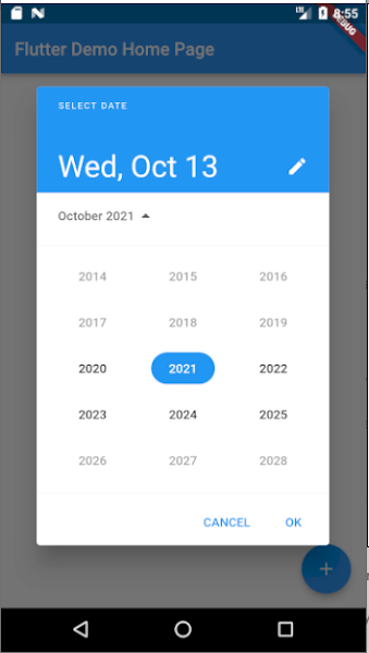
Show the year list first when open date picker
This option [initialDatePickerMode: DatePickerMode.year] open date picker to select year first, then user can select date later once year selected. void openDatePicker(BuildContext context) async {
final DateTime? picked = await showDatePicker(
context: context,
initialDate: selectedDate, // initial date
firstDate: DateTime(2020), // date range limit from
lastDate: DateTime(2025), // date range limit upto
initialEntryMode: DatePickerEntryMode.calendar, // show text input mode
initialDatePickerMode: DatePickerMode.year, // will show year selection first
);
if (picked != null && picked != selectedDate) {
setState(() {
selectedDate = picked;
});
}
}
|
Allow the user to enter a date from a specific day range
  void openDatePicker(BuildContext context) async {
    final DateTime? picked = await showDatePicker(
      context: context,
      initialDate: selectedDate,
      firstDate: DateTime(2020),
      lastDate: DateTime(2025),
      selectableDayPredicate: _decideWhichDayToEnable,
    );
    if (picked != null && picked != selectedDate) {
      setState(() {
        selectedDate = picked;
      });
    }
  }

  bool _decideWhichDayToEnable(DateTime day) {
    if ((day.isAfter(DateTime.now().subtract(Duration(days: 1))) &&
        day.isBefore(DateTime.now().add(Duration(days: 10))))) {
      return true;
    }
    return false;
  }
|
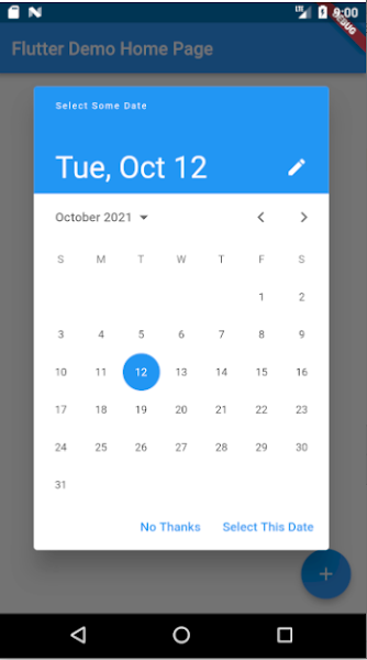
Change header title and button text
  void openDatePicker(BuildContext context) async {
    final DateTime? picked = await showDatePicker(
      context: context,
      initialDate: selectedDate,
      firstDate: DateTime(2020),
      lastDate: DateTime(2025),
      helpText: 'Select Some Date',
      cancelText: 'No Thanks',
      confirmText: 'Select This Date',
    );
    if (picked != null && picked != selectedDate) {
      setState(() {
        selectedDate = picked;
      });
    }
  }
|
Change date picker display theme like font color, background color, font size, button color and size
  void openDatePicker(BuildContext context) async {
    final DateTime? picked = await showDatePicker(
      context: context,
      initialDate: selectedDate,
      firstDate: DateTime(2020),
      lastDate: DateTime(2025),
      builder: (context, child) {
        return Theme(
          data: Theme.of(context).copyWith(
            colorScheme: ColorScheme.light(
                primary: Colors.green,
                primaryVariant: Colors.black,
                secondaryVariant: Colors.black,
                onSecondary: Colors.black,
                onPrimary: Colors.white,
                surface: Colors.black,
                onSurface: Colors.black,
                secondary: Colors.black
            ),
            textTheme: const TextTheme(
              headline4: TextStyle(fontSize: 22.0, fontWeight: FontWeight.bold),//3
              bodyText1: TextStyle(fontSize: 25.0),//year selection
              subtitle2: TextStyle(fontSize: 22.0), //2
              caption: TextStyle(fontSize: 24.0),//day selection
              overline: TextStyle(fontSize: 22.0), //1
            ),
            dialogBackgroundColor: Colors.lightBlueAccent,
            textButtonTheme: TextButtonThemeData(
              style: TextButton.styleFrom(
                primary: Colors.red, // button text color
                textStyle: TextStyle(
                  fontSize: 22, // button text size
                )
              ),
            ),
          ),
          child: child!,
        );
      },
    );
    if (picked != null && picked != selectedDate) {
      setState(() {
        selectedDate = picked;
      });
    }
  }
|
Pages
▼


No comments:
Post a Comment